
By Jack Dunphy, Writer


In the age of the media, listeners can still look to album covers to tell a story.
Obviously some artists do a better job than others at finding that one picture that conveys the vibe of their whole album. In the case of Liquid Swords by the GZA, you see a bunch of ninjas on a chess board and one of them is getting stabbed- you can tell you’re in for a battle when you press play.
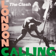
For London Calling by the Clash, we see bassist Paul Simonon smashing his guitar, and just know we’re about to get some rebellious rock anthems.
Now how about Baby G.O.A.T. What information is there to be gleaned from Kevo Muney’s infamous cover? There’s so many goats you’d think Kevo Muney must be the greatest of all time, and yet I can just about guarantee you’ve never heard of him.
“The difference between good and bad [album] artwork is the contribution to the overall work of art.”
William Halpern, New Paltz Middle School Music Teacher
While of course the most important part of an album is the music itself, an album cover can really make or break the experience of listening to an album. But don’t just take my word for it.
According to music teacher at New Paltz Middle School, William Halpern, “The difference between good and bad artwork is the contribution to the overall work of art. Album artwork, and the music contained within the album should not be easily separated, they should work hand in hand to create an experience for the consumer.” The GZA and The Clash both did this masterfully, creating a multi-sensory experience in which the artwork makes the music better, and the music makes the artwork better.

Music is one of the only visual marketing mediums where artists really express themselves anymore. Video game box art used to be intricate, hand drawn designs that immerse you into the world of the game. As of late, the “shadowy dude holding gun” trend has become a mainstay, leaving little room for creativity.
Movie posters have the same issue. What used to be so iconic has become lots of blue and orange characters of varying sizes looking into the distance. In the digital age where you don’t even have to leave your couch to download a game or watch a movie, many artists have gotten lazy. Back in the day, customers had to look through a bunch of albums, games, or movies in a store before deciding on just one or two to purchase.

If your album was sitting on the shelf with a cover like Donda, it wasn’t going to sell. You might think this is just a black square. But it’s not. This is literally the cover of Ye’s latest project.
Despite shadowy men and multicolored actors, music is different. Album covers remain a way for artists to express the feel of their album. A good cover can transport you into the world of the album. Some album covers even transcend the music, becoming known by people who don’t even know who Nirvana, The Beatles, or Pink Floyd were. You’ve probably seen some of these images even if you can’t name the artist or name of the album. Album covers, especially when backed by powerful music, illustrate the cultural happenings of the time like no other art form can.
Halpern again has something insightful to add, saying that, “Album artwork can be a snapshot of the culture surrounding the creation of a work of art. In general, music responds to cultural stimuli, it doesn’t create cultural stimuli.”
He cites Straight Outta Compton by NWA as a clear example of this, saying “The unsmiling faces and the brandished weapon further show us who the group were. Their music was music of anger, of sadness, of disillusionment. These are young men who felt that they needed to make their own way in society, and the album artwork reflects their willingness to do so.”

On a weaker note, many album covers seem like an afterthought for the artist. Like their label reminded them that they need one and so they slapped one together in ten minutes and that’s what ended up on the cover. It is unbelievable that artists will spend years of their lives working on a body of work that might be really well put together, just to punctuate it with a bland visual. Brittany Spears has made the same face on her albums for the last two decades, and I swear if I see all 4 members of Weezer evenly spaced on a monochrome background again I’m gonna lose my mind. Adele had 3 consecutive albums with shadowy closeups of her face as the cover. Even if the music is good, this redundancy is boring and uninspired, detracting from the listening experience.
Another key aspect of how an album cover makes you feel is its color. Deciding what color your music sounds like is a key step for artists. Albums with more grey-scale cover art are often more serious, moody, or even rageful. Comparatively, albums with more color often have more upbeat and happy music.

The dark red on Beach House’s Depression Cherry is, for lack of a better word, depressing. This sets you up to listen to the music, as the tracks go into heavy topics like grief and loneliness. In contrast, My Beautiful Dark Twisted Fantasy by Kanye has a bright, triumphant red. Mr. West described the album as him “fulfilling a perception”, which he fully does through the flashy and braggadocious tracks of MBDTF. Color can be an essential part of the listening experience, shaping the emotions that the music elicits.
These different elements of album artwork are also combined for some spectacular results. Tyler, the Creator’s Igor is backed by a soft pink, but his face as the central image clearly steals the show. His face is black and white, jaggedly cut out and pasted there. His pained, dark face looks out of place on the soft pink, which is reflected in the music.
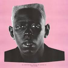
The album follows Igor, a character who feels constantly out of place, as he is in love with a guy who is in love with a girl. This love triangle leads him to feel like a sidekick. Out of place. Like Igor from Frankenstein, and like Tyler on the cover. This perfectly sets you up for the listening experience of the album, as this juxtaposition is further explored in the tracks. While many of the beats are upbeat and catchy, what Tyler raps and sings about on this project is much darker.

At the end of the day, you need the music to really determine how good an album is. The cover for Kanye’s Life of Pablo looks like it was created in MS Paint by a toddler in 45 seconds, but paired with the music, it fits perfectly. The whole album is Kanye’s battle between the pictures we see on the cover: his family, and… uh… the entertainment industry shall we say. The cover begs the question “ WHICH // ONE” on the cover, as even Kanye is unable to answer this question for himself. The cover art, as unaesthetic as it is, is a perfect visual for Kanye’s emotions on this album.
Album covers are some of the most powerful, era-defining mediums of art in modern history. Some reflect the artist’s state of mind, while others respond to the zeitgeist of a particular time. Further, some album covers use vivid colors to create images that belong in museums, while others transform a group of tracks into the cohesive body of work we call an album.
Halpern said it best when he said that “Album artwork is special. The partnership between an album and its cover form a bond that can take you to a place that is truly unique.”
